Kirby Kollage

Fantastic Four #33: Kirby Kollage 4

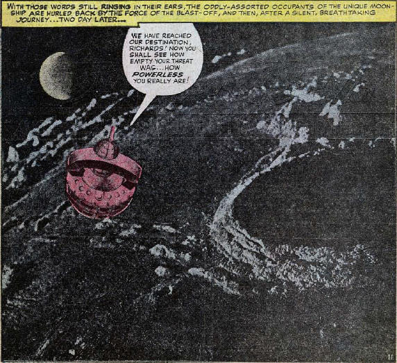
Fantastic Four #33, page 8

Fantastic Four #33: Kirby Kollage 4

Script: Smilin' Stan Lee

Art: Jolly Jack Kirby

Inks: Chucklin' Chic Stone

Lettering: Amiable Art Simek

Here, we see the difference between the internal printing and the cover printing seen last week. The detail of the collage is lost, requiring the fluorescent colour highlights to lend definition to the murky image. Being an underwater collage, at least the murkiness and the spot colours evoke what it's depicting, but that feels more by luck than design (not a phrase I would like to use often with Kirby!).

Unlike the earliest collages, which just ran with the idea of 'weird', this page has a clear design to it, utilising some great pictures of underwater life (although the giant prawn is a little suspect). Working within a clear design concept strengthens the collage at this stage, and it feels that following this issue, the collages are a lot more focused in what they are depicting.

Check out our coverage of Fantastic Four #33 on our thirty-seventh episode: Yes, Mr Lister, Sir!

Fantastic Four #33: Kirby Kollage 3

Fantastic Four #33, cover page

Fantastic Four #33: Kirby Kollage 3

Script: Smilin' Stan Lee

Art: Jolly Jack Kirby

Inks: Chucklin' Chic Stone

Lettering: Amiable Art Simek

The third outing for Jack Kirby's photo collages sees them arrive on the cover to Fantastic Four #33. There is plenty of talk about what makes a cover eye-catching and distinctive, and I can only imagine the impact of seeing this mixed-media collage on the comics racks in 1964. In the realm of 1960s Marvel Comics, only Jim Steranko's collages work in the same area, and these were used to deliberately invoke a psychedelic, altered perception feel for his Strange Tales and SHIELD covers.

The higher quality of printing for the cover really benefits the collage. There's no murky blacks, causing you to squint at the page, trying to work out what the image is trying to present. The printing picks up every piece of detail, presenting the richness of the underwater kingdom, even in black-and-white printing. This allows Kirby to play with the blending of the media, with some of his pencils depicting the walls of Atlantis blending effortlessly into the background.

A superb cover, and possibly my favourite seen for any issue to date.

Check out our coverage of Fantastic Four #33 on our thirty-seventh episode: Yes, Mr Lister, Sir!

Fantastic Four #32: Kirby Kollage 2

Fantastic Four #32, page 3

Fantastic Four #31: Kirby Kollage 2

Story by: Stan Lee (Who has never been more dramatic!)

Illustrations by: Jack Kirby (Who has never been more thrilling!)

Inking by: Chic Stone (Who has never been more realistic!)

Lettering by: S. Rosen (Who has never been more than an hour late!!)

The second Kirby Kollage in the Fantastic Four makes a number of choices that work against the visual impact of the change of media. First, splitting the page into two separate images diminishes the 'wow' factor of changing location and media. Secondly, there's no sense of space being big and wondrous, as would be effectively portrayed by future pieces. Space is... stars and planets, with some colouring. I find it difficult to look at this as anything other than an experiment in form.

Technology isn't quite working on Kirby's side, either. There's a very noticeable dark strip down the left side of the first panel, where the reproduction process was compromised. The colouring also seems very on-the-nose, attacking the image rather than complementing it. Thankfully, this is an early mis-step on the way to astonishing images that still stand out as some of most innovative pieces of comics art ever.

Check out our coverage of Fantastic Four #32 on our thirty-sixth episode: John Byrne Quits Comics

Fantastic Four #29: Kirby Kollage 1

Fantastic Four #29, page 11, panel 3

Fantasticast Four #29: Kirby Kollage 1

Written with a dash of greatness by: Stan Lee

Drawn with a hint of glory by: Jack Kirby

Inked with a touch of drama by: Chic Stone

Lettered with a bottle of india ink by: S. Rosen

Presenting the very first Fantastic Four collage as created by Jack Kirby. Combining photographs, artwork and dialogue balloons, this is the first of several notable collages from Kirby over the years. It's a rarely-used technique in western comics, normally done for fun, novelty or kitsch value. But not in Jack's hands. Here, the form would be used to provide depth and wonder to his comics, as seen in this journey to the moon.

Some of Kirby's collages would suffer from the printing techniques of the 1960s, especially when he started combining multiple photographic sources to convey his vision. However, it's these same printing techniques that make his collages really work. The roughness of the reproduction of the photograph allows it to blend well with the detailed inking work provided by Chic Stone, making for a relatively smooth transition between the forms.

Such a shame that letter Sam Rosen would make a grammatical error in the caption to distract from the gorgeous artwork...

Check out our coverage of Fantastic Four #29 on our thirty-second episode: Now With Genuine People Personalities

We are eligible for nomination in the first UK Podcasters Award, in the Games & Hobbies category. Across the month of July, you can visit http://ukpodcasters.com/directory/podcast/the-fantasticast/ and click the nominate button. You can nominate us once per day between now and the end of the month, and we would be very grateful if you would be able to do this.